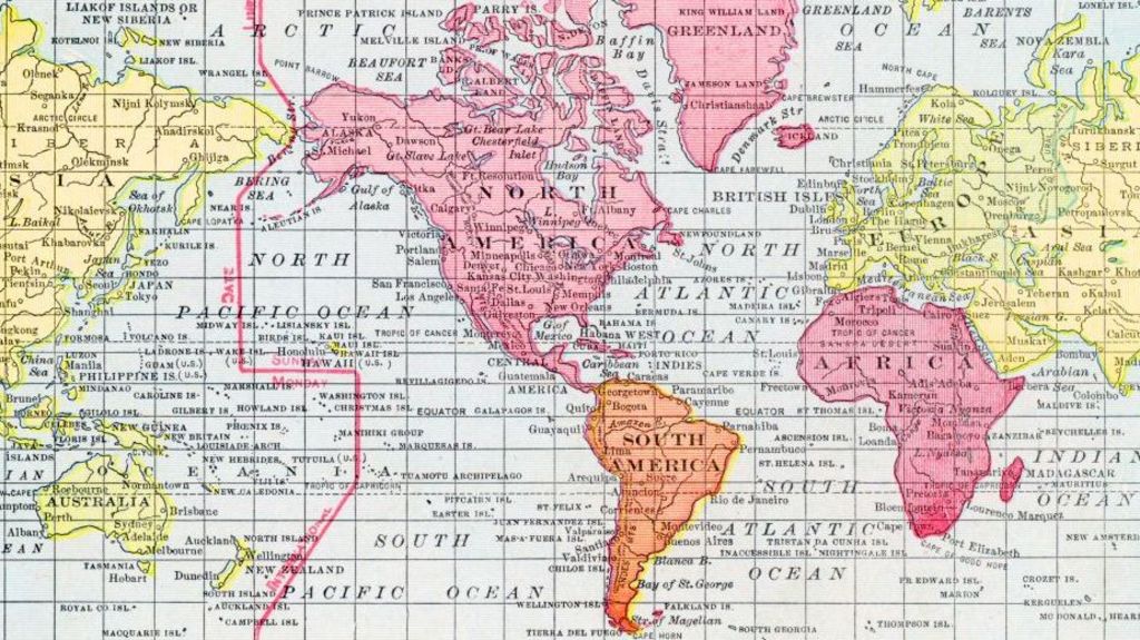
For more than 450 years, the Mercator projection has stood as the world’s most widely used map format, found in classrooms, broadcast news, online platforms, and consumer navigation tools including Google Maps. But while it revolutionized 16th-century ocean navigation, it carries a long-criticized flaw: dramatic size distortion that shrinks equatorial landmasses and exaggerates the scale of regions closer to the poles. Now, the United Nations has formally backed a new mapping standard to correct this long-standing geographic inaccuracy.
Developed in 1569 by Flemish cartographer Gerardus Mercator, the projection was built for a very specific purpose: helping European sailors plot consistent compass bearings. As University College London cartography professor James Cheshire explained, Mercator’s design intentionally preserved straight lines for constant directional travel, a feature that made it uniquely useful for maritime voyages. To maintain this accuracy on a two-dimensional plane, the projection stretches grid lines progressively further apart as they approach the poles, a necessary tradeoff that warps the perceived size of all landmasses. The most famous example of this distortion shows Greenland as roughly the same size as Africa, when in reality the African continent is 14 times larger.
Critics argue that this distortion is not merely a geographic triviality—it shapes global perceptions of nations and regions. Larger visual representation, they note, leads people to instinctively view landmasses as more geopolitically and economically significant, while shrinking equatorial nations implicitly downplays their global role. Kenyan geographer Kioko Muendo emphasized that maps do more than guide travelers: they frame how global audiences understand Africa’s vast natural resources, large population, and untapped investment potential. For decades, Muendo and other experts have pushed for a replacement that reflects geographic reality more fairly.
The UN’s “Correct the Map” resolution formally endorses the Equal Earth projection, a 2018 design developed by an international team of cartographers to accurately represent the relative area of all global landmasses. The projection was first adopted by the 54-member African Union before winning UN backing, as it resolves the most problematic size distortions of the Mercator format. Like all flat map projections, however, it requires tradeoffs: to preserve accurate land area, the Equal Earth projection sacrifices the straight directional lines that made Mercator indispensable for navigation, and cannot be used to measure true distances between points.
This tradeoff is an unavoidable constraint of cartography: it is mathematically impossible to perfectly represent the three-dimensional curved surface of a globe on a two-dimensional flat map, meaning every projection must prioritize some features at the expense of others. The Equal Earth projection is not the first alternative to Mercator: the Gall-Peters projection, developed in its modern form in the 1970s, also prioritized accurate area representation, but it severely distorts the shape of landmasses, stretching equatorial regions and compressing polar areas while remaining useless for navigation. Earlier initiatives also failed to gain widespread global adoption, leaving the centuries-old Mercator projection dominant despite its flaws.
As global organizations and educational institutions begin transitioning to the Equal Earth projection, cartographers note that the shift is as much about changing global perceptions as it is about geographic accuracy. The UN’s move marks the first formal global endorsement of a map that centers fair representation of lower-latitude, majority Global South nations, opening a new chapter in how the world visualizes itself.